
How it ALL started
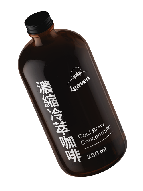
This started with the a call with a very enthusiastic man that told me all about “the magic process of fermentation” (Leaven means ferment, yeast). He had really put a lot of dreaming and thinking and research into it, and it showed. His excitement was contagious and the visual identity for Leaven started growing.
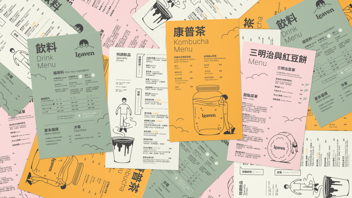
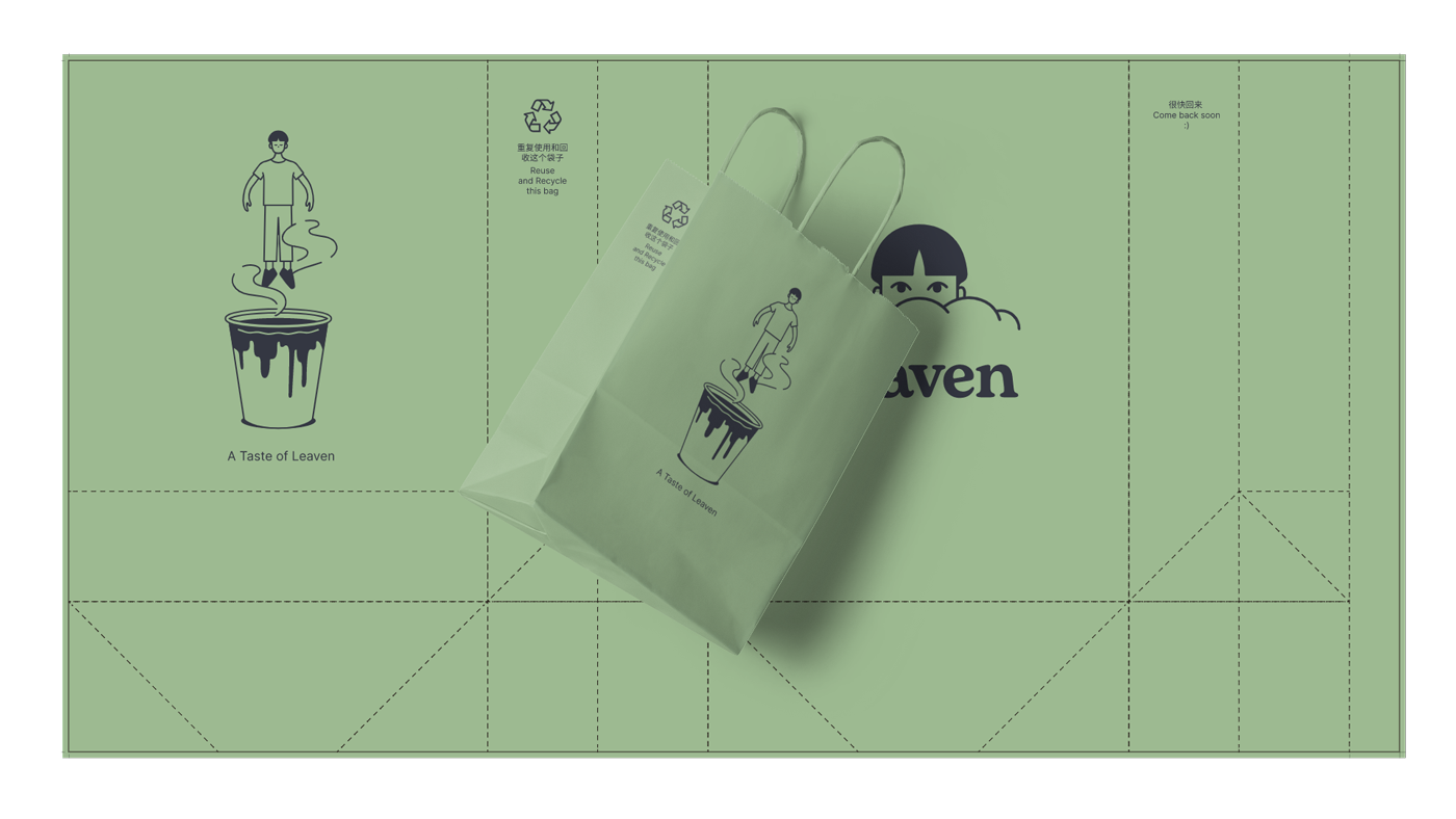
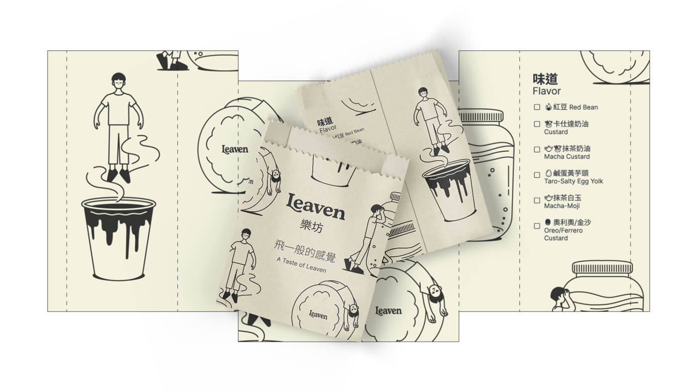
Since “Leaven” is almost a homonym of “Heaven”, we started from the slogan “A taste of Leaven” and built the identity around that concept, we thought of a place like heaven for coffee lovers and created a character that lives in that fantasy.
CLIENT Leaven
MARKET Crafted fermented drinks, Coffee supplies, Coffee Shop.
LOCATION Taichung, Taiwan
YEAR 2022